Crunchbase: What alterations could we make to Crunchbase to better cater to the expanding community of startup entrepreneurs?
Context
A 4-month school project sponsored by Crunchbase
Team
2 designers + 2 researchers
Contribution
Led the design and prototyping
Conduct user interviews
Conduct design evaluation
Create presentation deck
Outcome
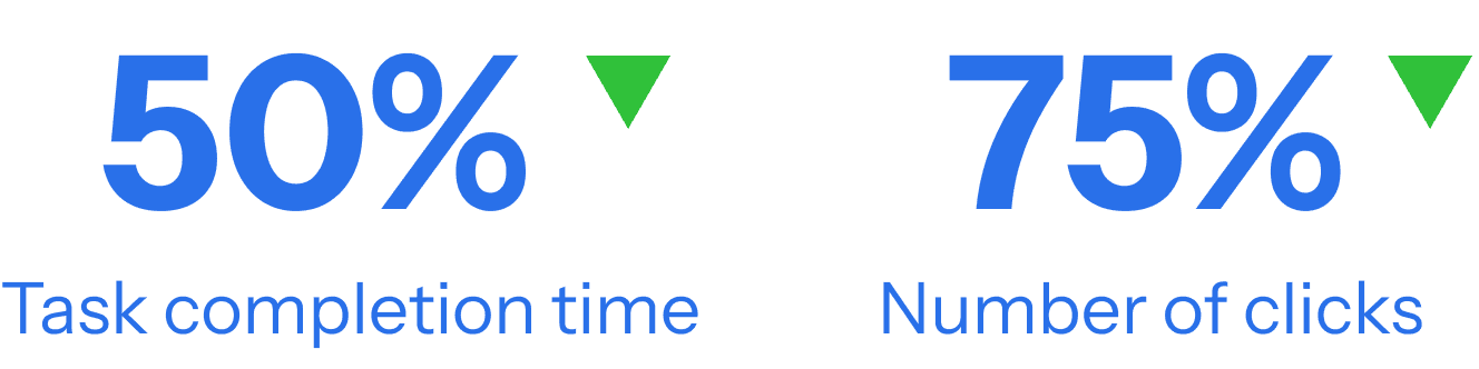
Redesigned the dashboard to include personalized onboarding, customizable widgets, and improved data visualization. The new design reduces user task completion time by 50% and decreases clicks by 75%.
consolidation
Let's make sense of these research data with the story of Sophia and her frustrations
TLDR
Background
What is Crunchbase
Crunchbase is a leading platform for discovering business information about private and public companies, providing data on investments, funding, and industry trends.
This project was commissioned by the Crunchbase UX team as our Master’s project to enhance their platform for a user group that has been largely overlooked: startup founders.

Problem statement
Increasingly used by startup founders but lacks features tailored to their funding and growth needs
Originally designed for investors and salespeople, Crunchbase has gained traction among startup founders seeking investor discovery, competitor insights, and market analysis. However, the platform lacks features specifically tailored to their needs, such as comparing competitors, tracking funding progress, and accessing more granular industry insights. As startup founders become a fast-growing user segment, adapting Crunchbase to better support their unique challenges and funding journeys presents a significant opportunity for growth.
outcome
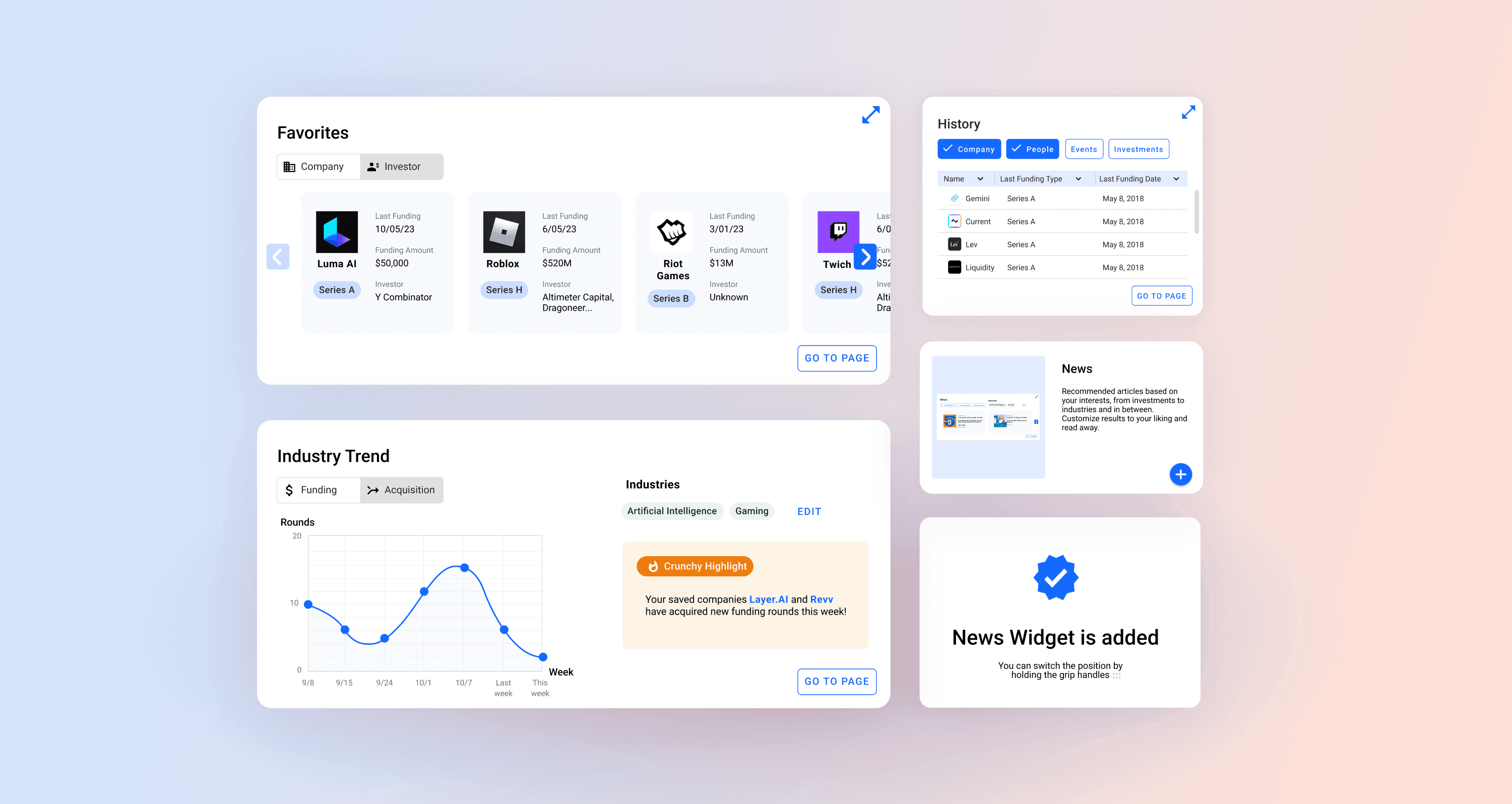
A customizable dashboard with flexible widgets
We designed a customizable dashboard with widgets to support startup founders at different funding stages. This scalable solution also extends to investors, job seekers, and journalists. Evaluation shows it reduces task completion time by 50% and click effort by 75% for startup founders.
Before

After

process
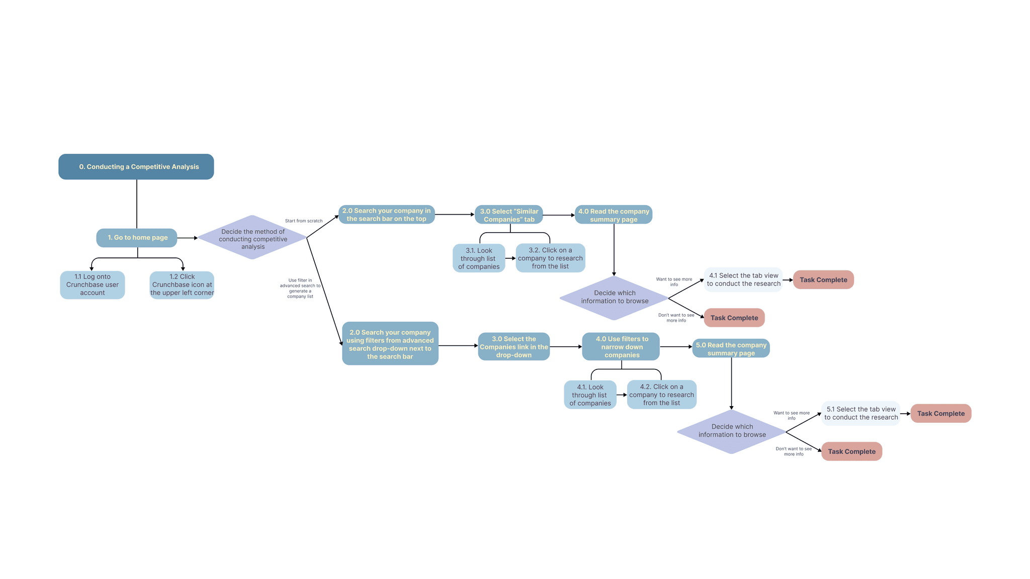
What is the process
Survey
Interview
Task Analyses
Ethnographic Research
Competitive Analyses
Persona
User Journey
Ideation
Prioritize Design Req.
Mid-fi Prototype
User Test & Iteration
High-fi Prototype n
Task Completion Time
Number of Clicks
Get started
First, let's talk about the users
user base
Who uses Crunchbase
Existing User Base


Growing User Base


Target useers
Why we chose to focus on startup founders


Founders
JBTD: Gain visibility for their startups, benchmark against competitors, and identify potential investors or partners.

Founders are the backbone of the data: Crunchbase thrives on information about startups—funding rounds, growth metrics, and company profiles—all of which originate from founders. Enhancing their experience improves the quality and freshness of data for all users.

Network effect: By engaging founders, you indirectly benefit other key segments (investors, sales professionals) who rely on founder-generated data for lead generation, deal sourcing, and market insights.
SURVEY
We surveyed 20+ startup founders to lay foundation for later research
We chose to distribute a survey to startup founders to understand their background traits, prior experience with information-searching platforms, their experience with Crunchbase.

After collecting 20+ responses, we learned that
A usual workday of a startup founder entails
managing companies, checking investments, getting in contact with investors, searching partnerships, checking competitors, helping us to identifying the key tasks.
Less than 12%
of startup founders use Crunchbase daily, while 44% use it weekly and another 44% use it annually. This suggests that for most founders, Crunchbase is a need-based platform rather than a tool for constant updates.
For Startup founders, Crunchbase is mostly used for
viewing company profiles, get investor insights, and contact info, helping us to identifying important tasks for task analysis.
Other tools they use
such as LinkedIn, Apollo, ZoomInfo to gather important information, which help us to identify platforms to conduct competitive analysis.
Interview
We observed and interviewed 4 startup founders in different stage of funding to understand their usage of Crunchbase
We conducted semi-structured interviews with four startup founders to explore growth opportunities for Crunchbase. Our goal was to understand their current account usage, how they engage with the platform, what alternative tools they rely on, and whether their needs vary across different funding stages.


After conducting interviews with 4 startup founders in different funding stages, we found:
Pre-Funding (Not Actively Raising)
Warm intros, networking tools, competitor research
No easy way to manage networks
Doesn’t see Crunchbase as immediately valuable
Pre-Seed / Angel (Early Investor Outreach)
Finding investors, filtering by stage, budget-conscious tools
Crunchbase Pro is expensive, paywall limits access
Uses free version but finds it financially unjustifiable
Seed / Early-Stage (Actively Raising Funds)
Finding niche investors, industry-specific funding, market fit research
Crunchbase lacks detailed funding accuracy
Relies more on Google, investor websites, and direct networking
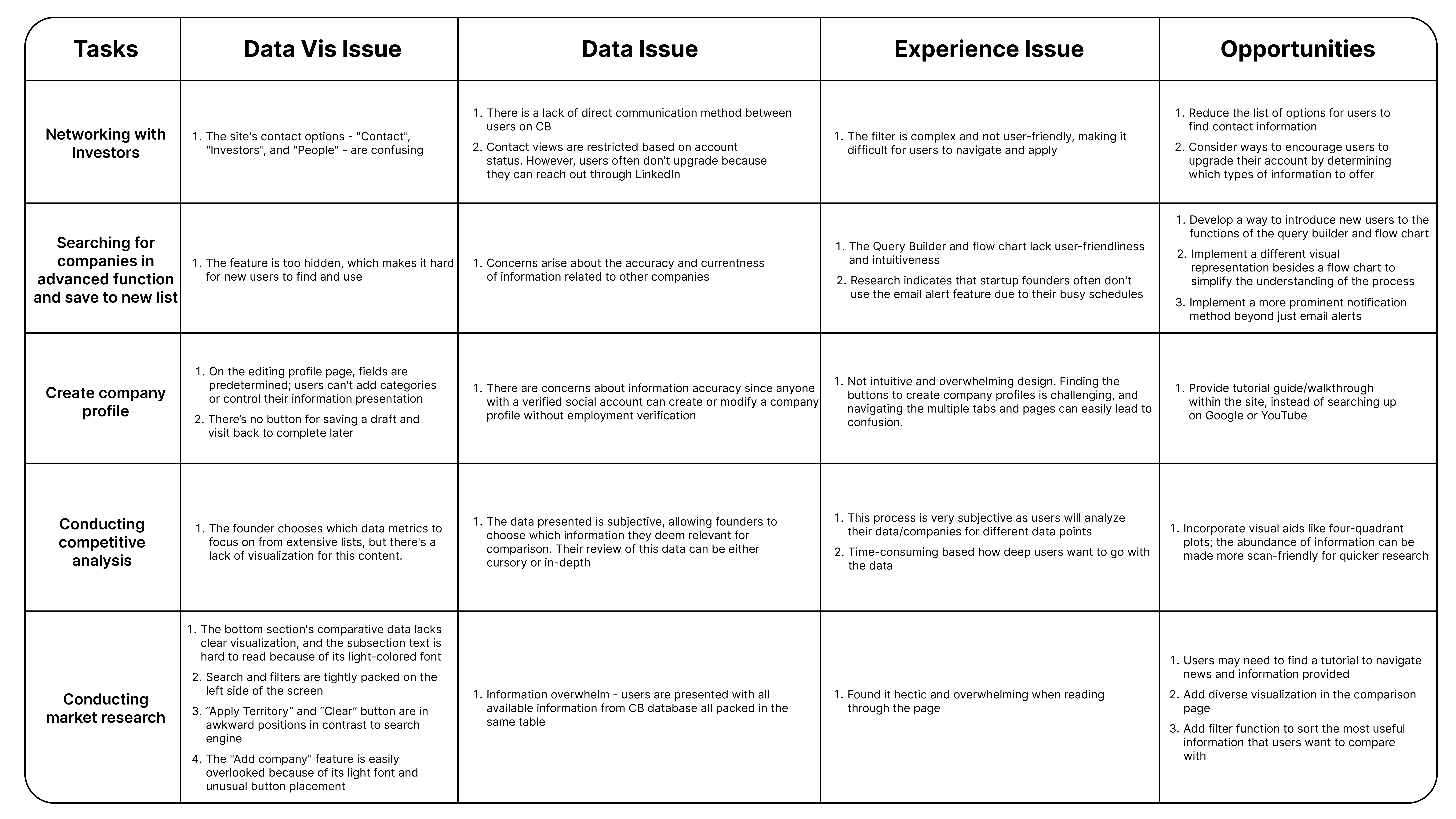
Task analyses
Conducted 5 task analyses to identify usability issues in key tasks performed by startup founders.
We conducted task analyses to map the step-by-step actions startup founders take on Crunchbase, identifying pain points at each stage. This approach provides a clear understanding of their workflow, highlighting usability challenges and opportunities for improvement.


After conducting 5 task analyses, we concluded that
consolidation
Let's make sense of these research data with the story of Sophia and her frustrations
persona
Say hi to Sophia
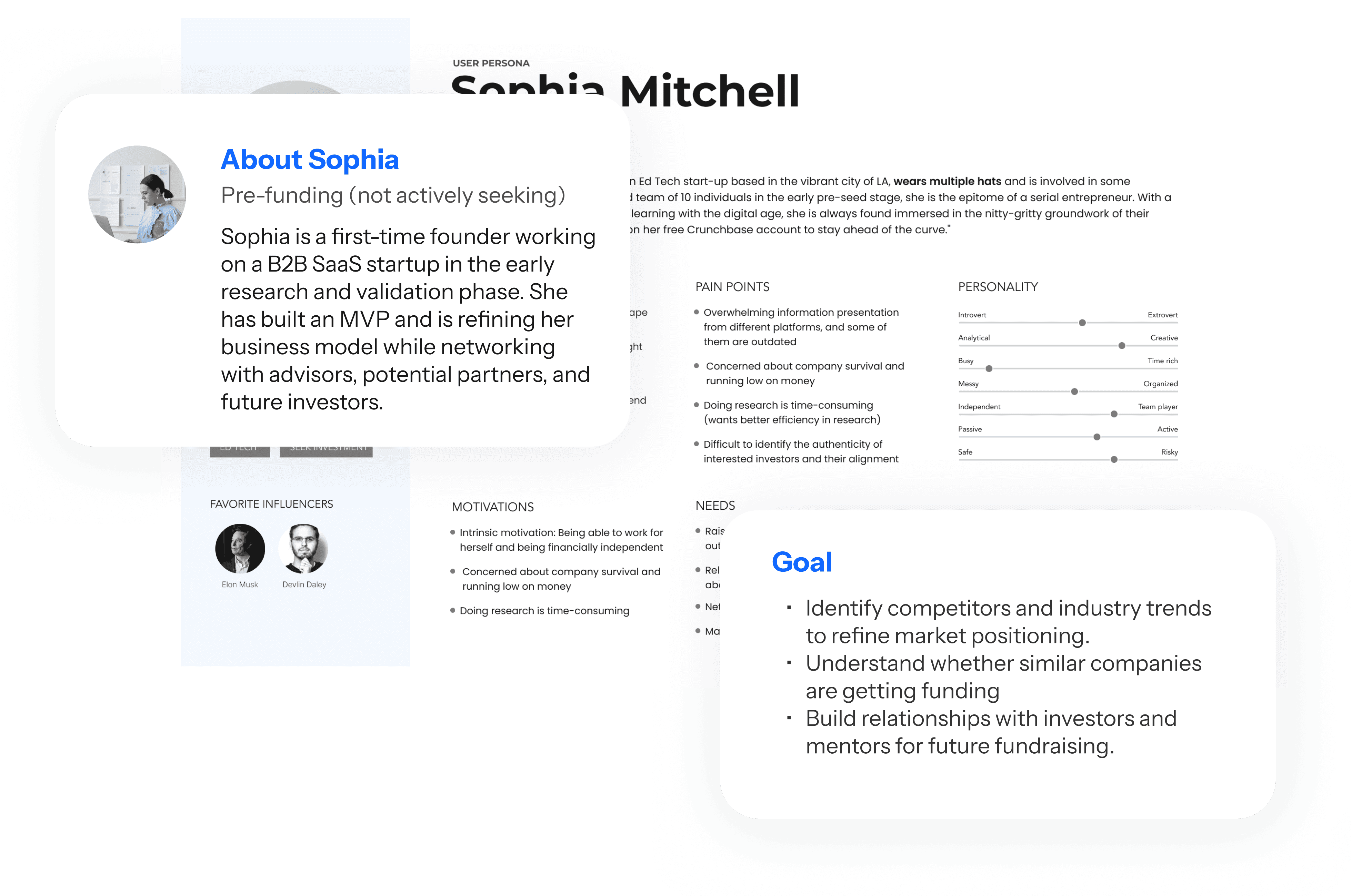
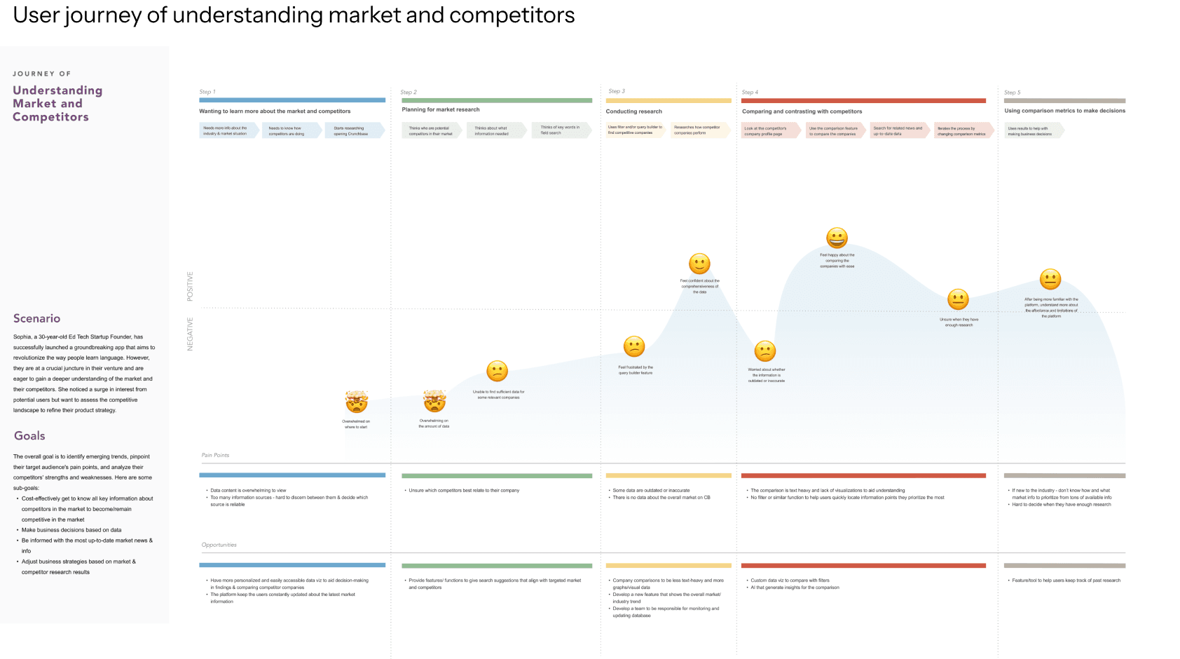
🤯 Overwhelmed on where to start looking for market/competitor information
Lack of data visualization to understand the whole picture of the market
Difficult to sift through and compile the information
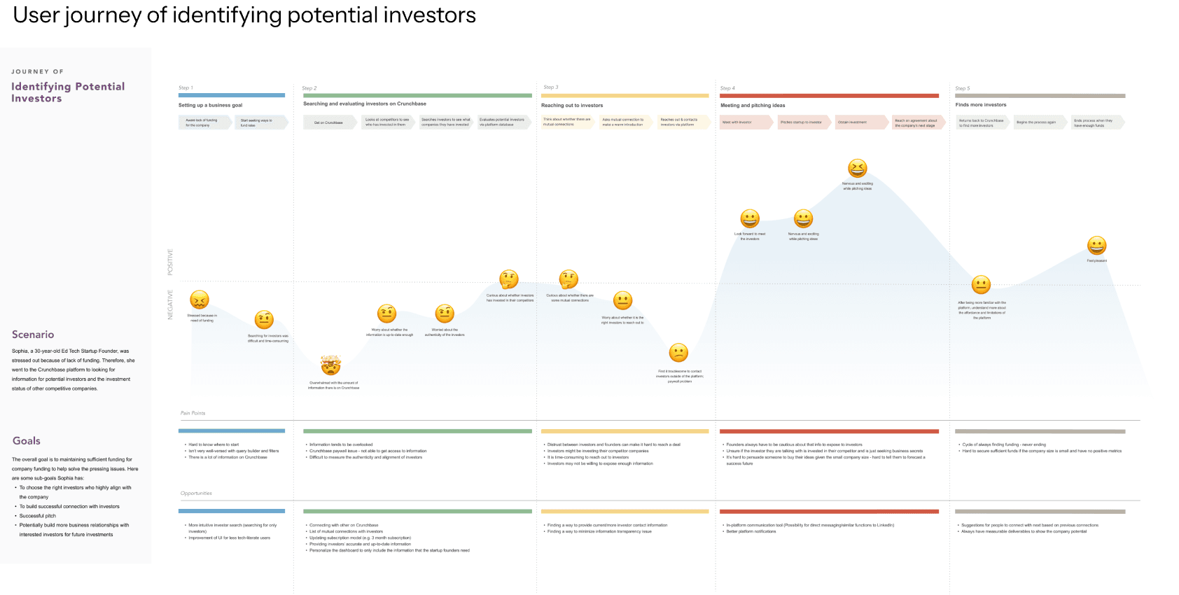
🤯 Find it troublesome to look for the right investors and contact them outside of the platform
Finding the ‘right’ investors to fund company is burdensome and takes a long time
Level of secrecy/distrust between founders and investors about information about companies
Outcome
Simplify the information architecture of the homepage with customizable widgets
The new homepage design includes customizable widgets, allowing users to add, hide, and rearrange them. This ensures users can view the most relevant information as soon as they open the dashboard. The side menu has been removed, with its functions integrated into the widgets to streamline task completion and minimize homepage confusion.

Outcome
Enhance the design of each individual data visualization
The data presented on the original Crunchbase platform is not intuitive enough, with some information hidden across separate pages, making it difficult for users to locate.


Outcome
Multiple viewing options for each widget, including a condensed view and a detailed view
The condensed view offers a quick overview, while the detailed view enables a more in-depth exploration, providing greater flexibility to meet the needs of our target users.
Outcome
Introduce a new feature: company comparison
Target users emphasized the importance of comparing companies, particularly competitors, side-by-side to gain insights. In response, we proposed adding a feature to enable company comparisons.
Design Process
Prioritizing design requirement
Based on our research, we identified the following design requirements. To proceed, we prioritized the top two based on the most critical pain points highlighted by target users and their scalability to a broader audience.
Among all the ideas we brainstormed, we selected the customizable widget concept as it
received the most positive feedback from the target users
provides the greatest flexibility for personalization
has great potential for enhancing data visualization.

Design Process
Standardize the widget size
After nailing down the direction, we started to set the standard sizes of the widgets, as we wish the users to be able to customize it and switch the positions of the widgets according to their preference.


Design Process
Determine what and how the information should be presented in each individual widget
To find out what our target users think of each widget, we ‘co-designed’ with our target users by presenting the mid-fidelity wireframes and ask them what information do you expect to see.


end
Finally, let's take a look at the impact
Design evaluation
Design evaluation and validation
To assess the effectiveness and usability of our new design, we conducted a comparison study. Five participants (n=5) completed four tasks on both the original Crunchbase platform and our prototype. We then compared the time taken and the number of clicks required to complete each task.


REFLECTION
Incorporate a more human touch to enhance engagement in data-heavy platforms
Data-heavy platforms like Crunchbase can easily overwhelm users with information, leading to disengagement. We discovered that adding a human touch can make a significant difference. For instance, introducing features like "Crunchy Highlight" can create moments of surprise and delight, keeping users engaged with the platform.
Design starts with simplification
Crunchbase has complex information architectures that can confuse users. Instead of adding more elements, focusing on subtraction and simplification offers a cost-effective way to enhance the user experience.
Conduct user testing with the prototype on the actual device
During user testing, we initially didn’t display the prototype within a device frame, such as a laptop. This made it difficult for users to assess how much information they could view at once. To provide better context, it’s essential to include a laptop frame in the prototype.