Melanoma Treatment
Facilitate the process for oncologists to connect their patients with clinical trials
For patients with aggressive melanoma, time is crucial. Yet, finding clinical trials, a primary treatment option, is difficult. In collaboration with Dr. Bryan Carroll from University Hospital, we improved clinicaltrials.gov's search and application functions, simplifying the process for oncologists seeking clinical trials for their patients.
Context
Sponsored senior capstone project
Status
Designed delivered
Contribution
User Research
Interaction Design
Team
Wenqing Yin
Sruti Srinidhi
Anna Rippert
Saloni Gandhi
Namita Rao
Who we are designing for
Melanoma Medical Oncologists
Melanoma medical oncologists (hereinafter called “oncologists”) are specialized doctors who focus on diagnosing and treating melanoma, a type of deadliest skin cancer.
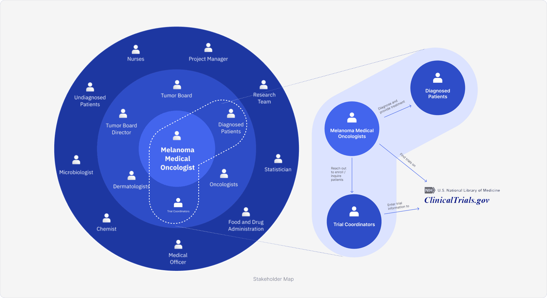
The following map shows the relationship between melanoma medical oncologists and other stakeholders such as patients and trial coordinators. Identifying the relationship helps us to think about our design in a more systematic way.
Problems
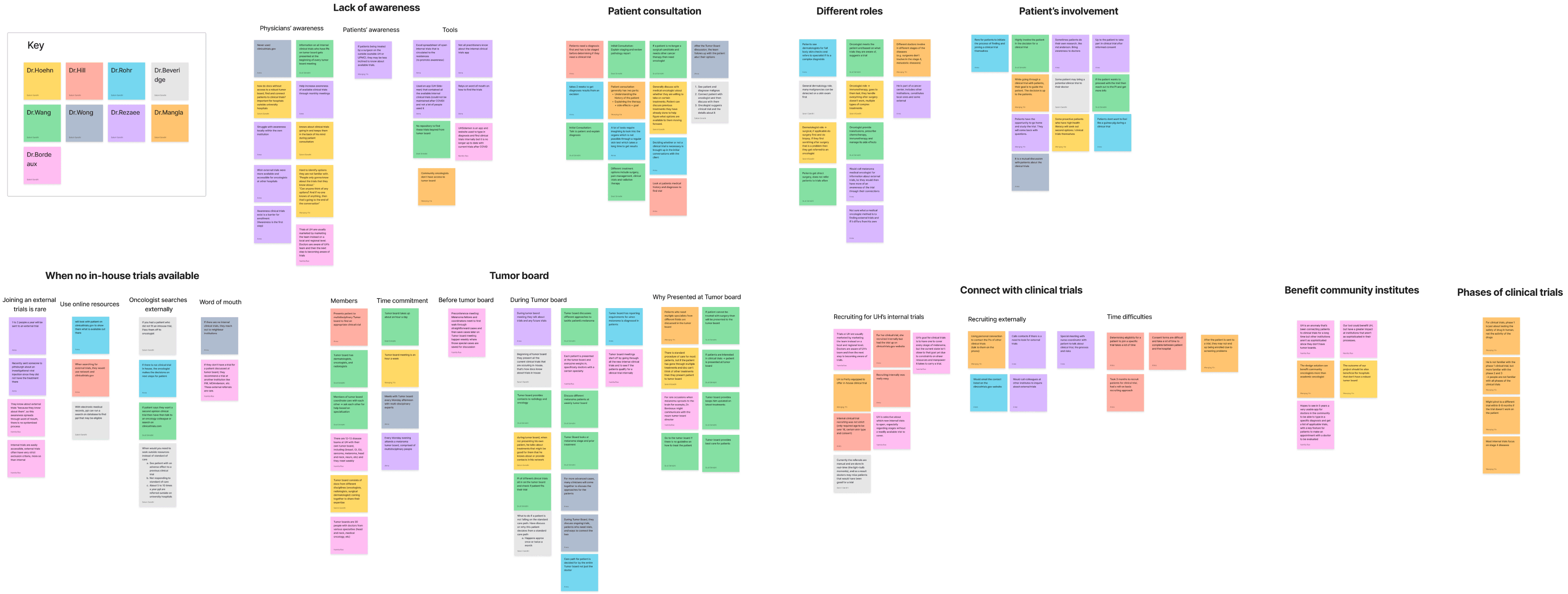
After synthesizing insights from the 10 interviews and think aloud activities we conducted along with domain and competitive research, we uncovered the following problem.
For oncologists, the process of searching for clinical trials, the first-line treatment option, is cumbersome.

Oncologist C

Oncologist A

Oncologist B
What are the causes?
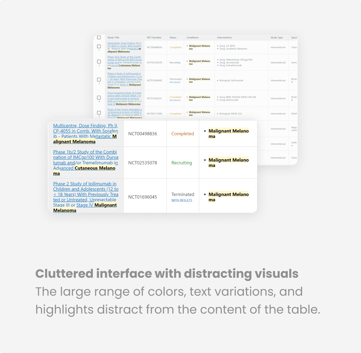
External clinical trials can be accessed through clinicaltrials.gov. However, it is not widely used due to usability issues.
Oncologists reply on their personal connections to find trials
Biases of replying too much on experts to find clinical trials
Current platform
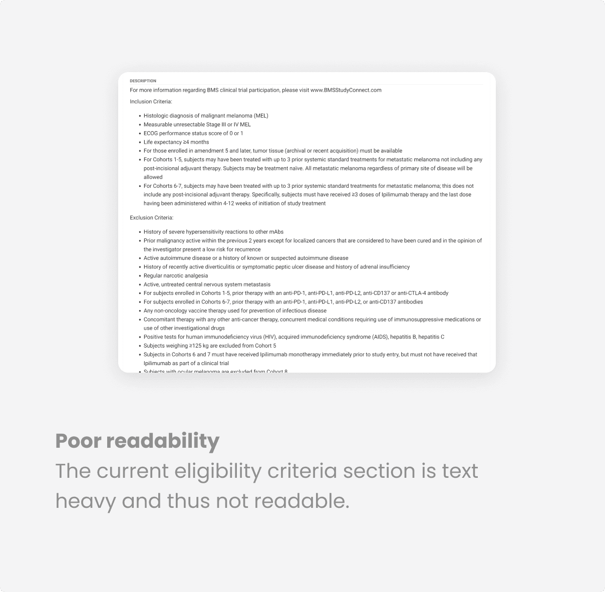
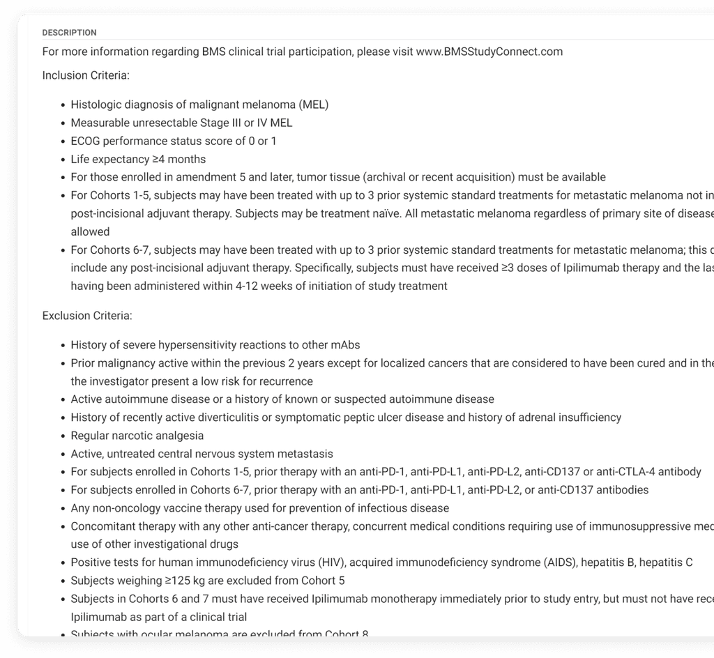
Issues of Clinicaltrials.gov
Solution
Improve clinicaltrials.gov for user-friendliness, reducing oncologist reliance on word-of-mouth or personal networks.
Watch the demo video from the perspective of an oncologist
Key Design and Rationale
A more holistic user journey
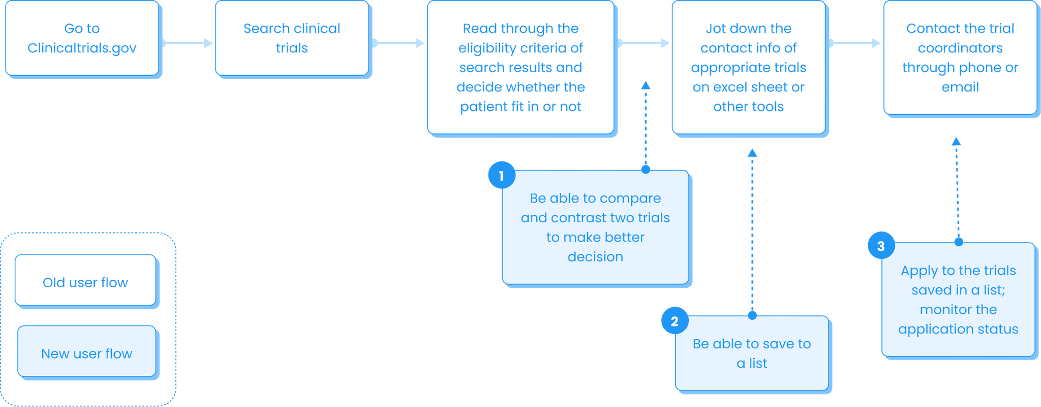
The user flow of the existing platform lacks essential components, resulting in a less-than-optimal user experience. To enhance the user flow and resolve these issues, we have introduced multiple new features. These newly added feature will make this a more seamless experience by eliminating the need for oncologists to switch between multiple platforms.
1
Trial Comparison Feature: This tool assists oncologists in making informed decisions by allowing them to compare different trials.
2
Saved List Functionality: Oncologists can now create and maintain lists of desired trials directly on the platform, eliminating the need to manually note them down on other platforms.
3
Trial Application Feature: A feature that streamlines the trial application process, sparing oncologists the manual effort of reaching out individually.
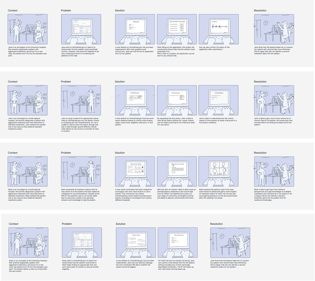
We refined the ultimate user flow by testing various storyboards with more than 10 oncologists. The final version incorporates those features that are validated by at least 5 oncologists.
Key Design and Rationale
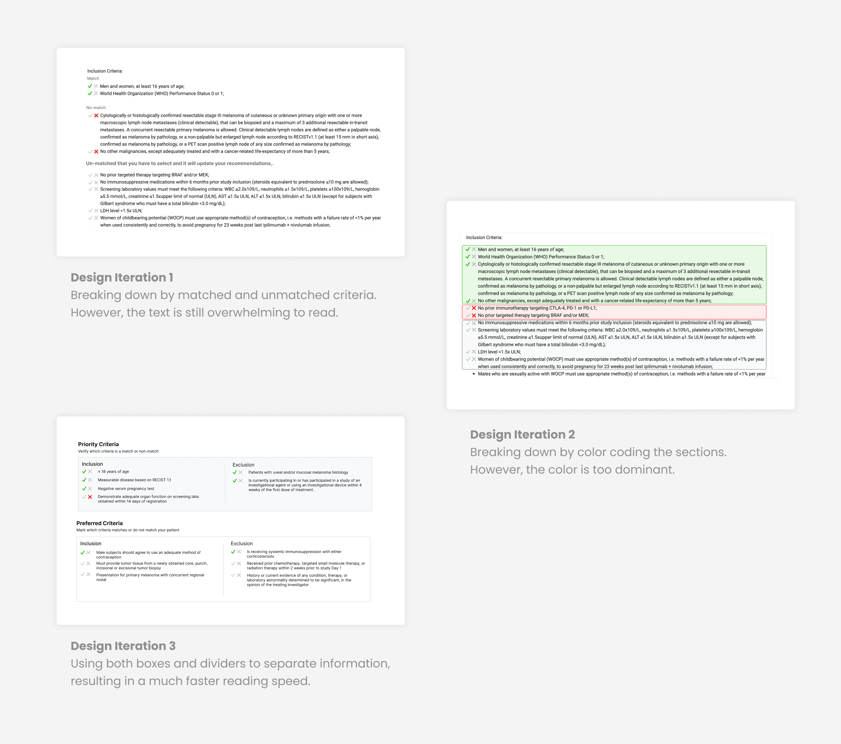
Enhance readability to expedite decision making process
The user flow of the existing platform lacks essential components, resulting in a less-than-optimal user experience. To enhance the user flow and resolve these issues, we have introduced multiple new features. These newly added feature will make this a more seamless experience by eliminating the need for oncologists to switch between multiple platforms.
