Horizone
Horizone: an AR food ordering system that is designed to help people make more informed choice as well as promoting Chinese food culture.
Team
Individual Project
(2 months)
Focus
Interface design within AR environment
Tools
Figma
Projector
Wood working
OVERVIEW
What is Horizone
"Horizone" is an augmented reality (AR) food ordering system implemented in a restaurant, meticulously crafted to empower people with informed decision-making capabilities while simultaneously serving as an educational tool for enriching their understanding of Chinese culinary culture.
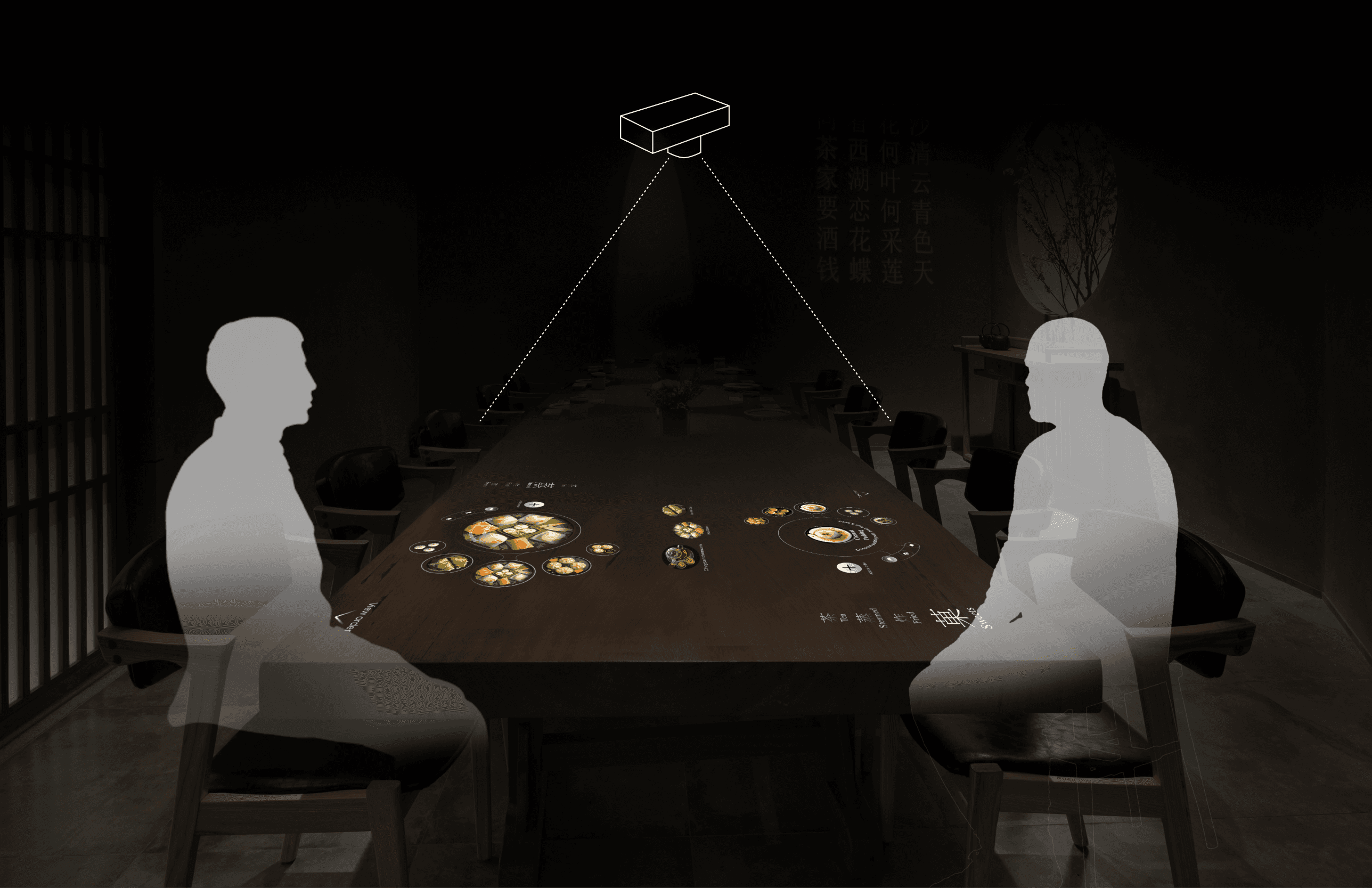
Core Experience
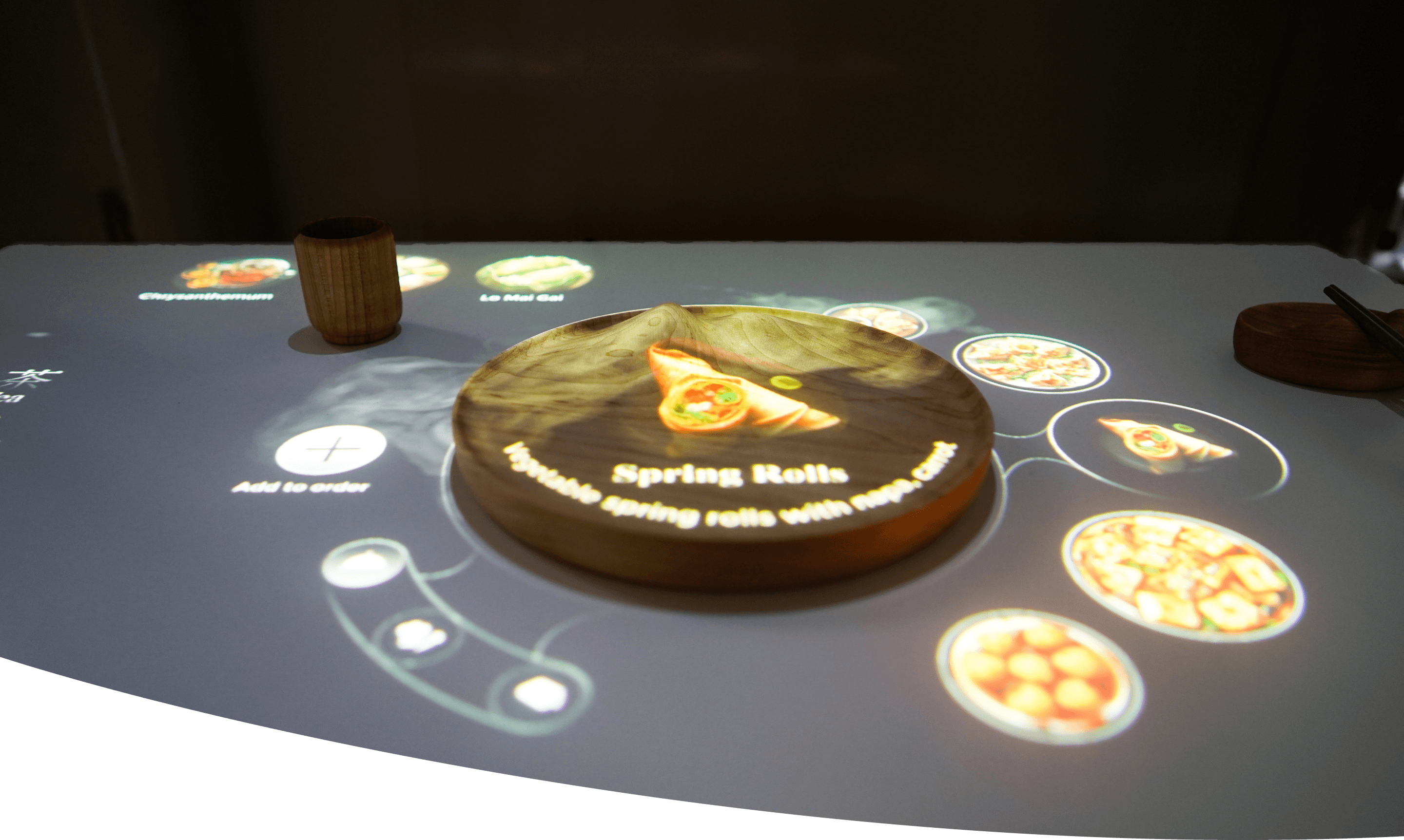
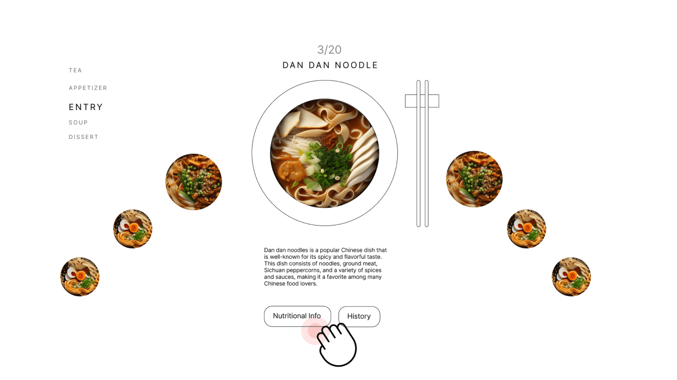
The food is “on” the plate
Being able to view the food at full scale on the plate helps people better envision what the food looks and tastes like
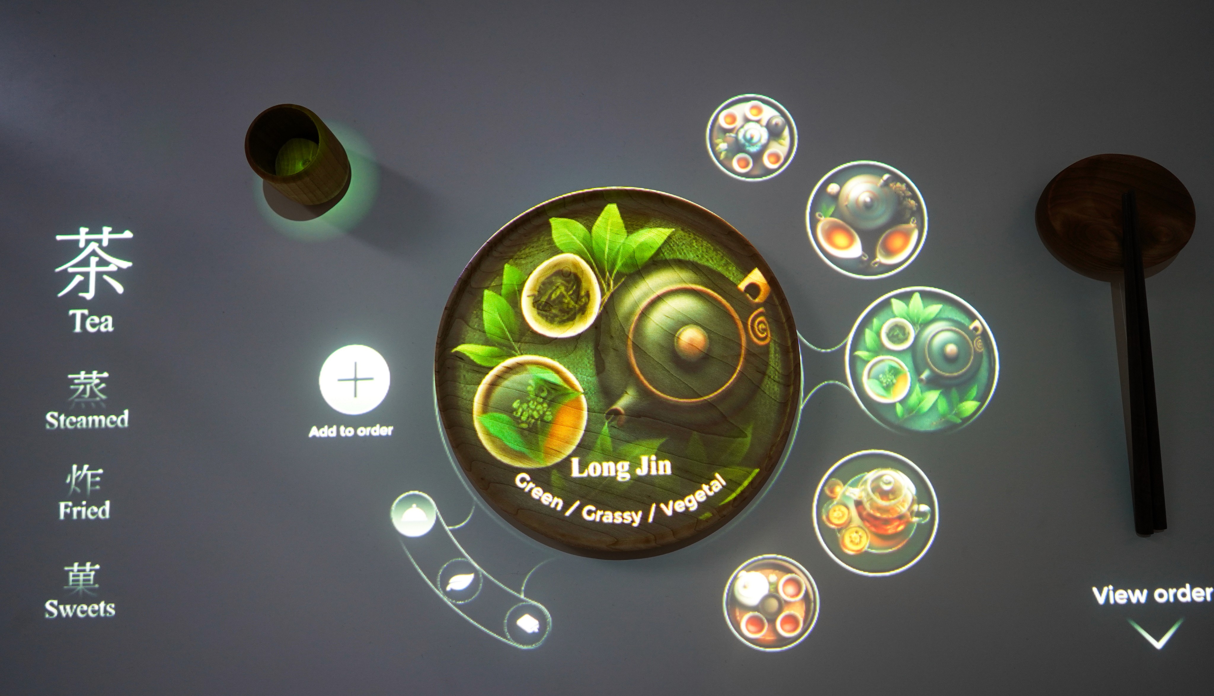
Core Experience
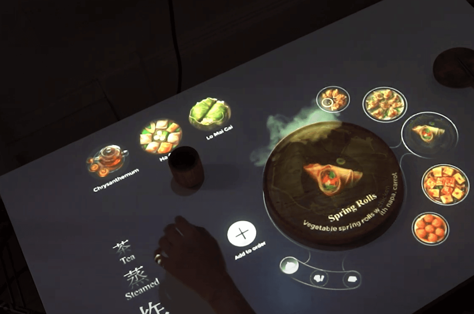
Select food from the menu
Swiping up and down to view the food from the menu, making it easier to go through the menu
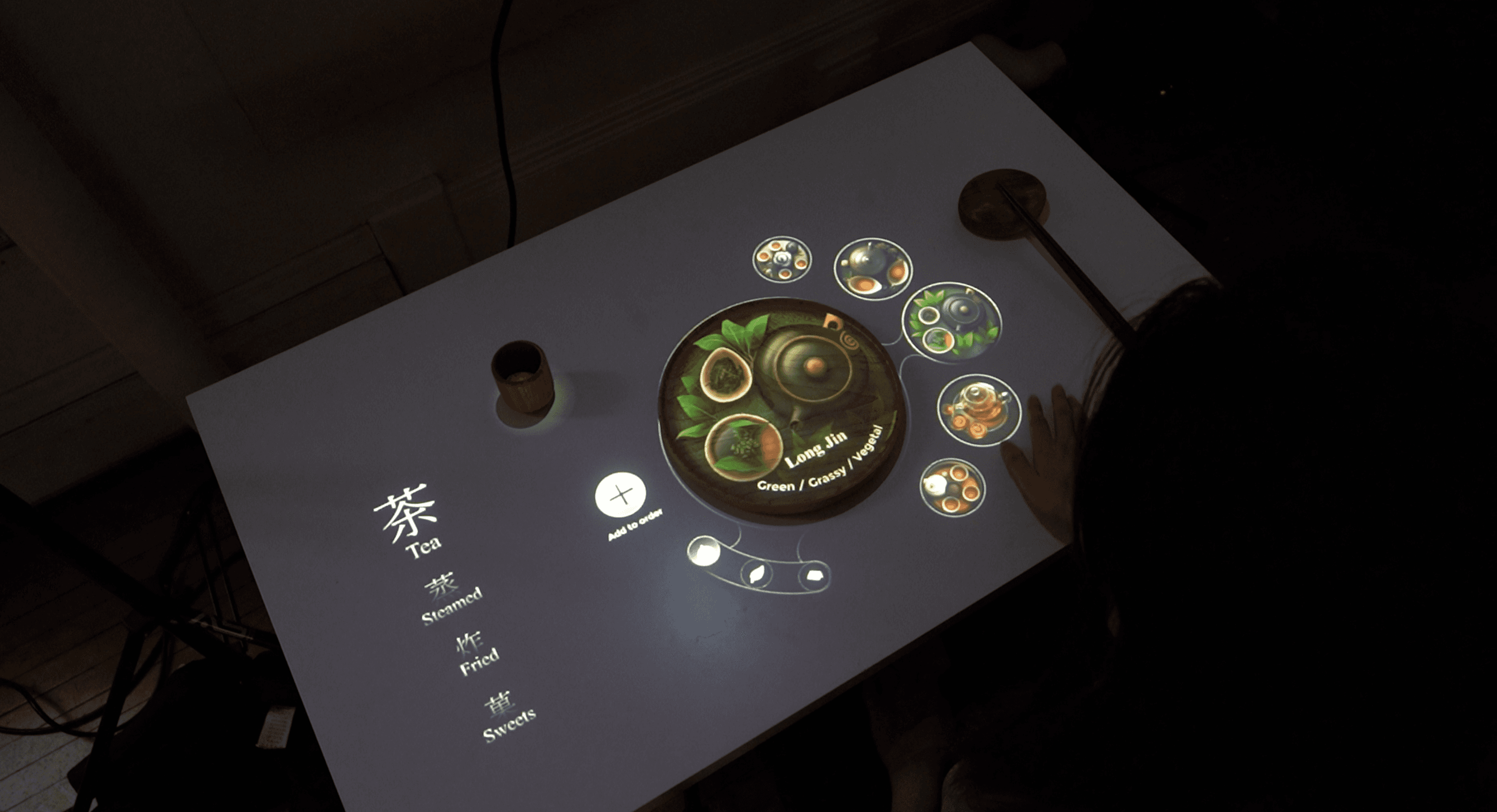
Core Experience
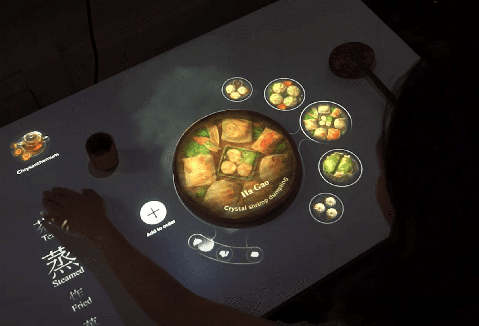
Learning about Chinese food culture
Being able to view the history / story behind each dish
Visual effect helps users to better “feel” how the food is cooked
While adding the dish to the middle of the table, the dish is pushed to the middle of the table to symbolize the sharing aspect of Chinese eating culture.
Core Experience
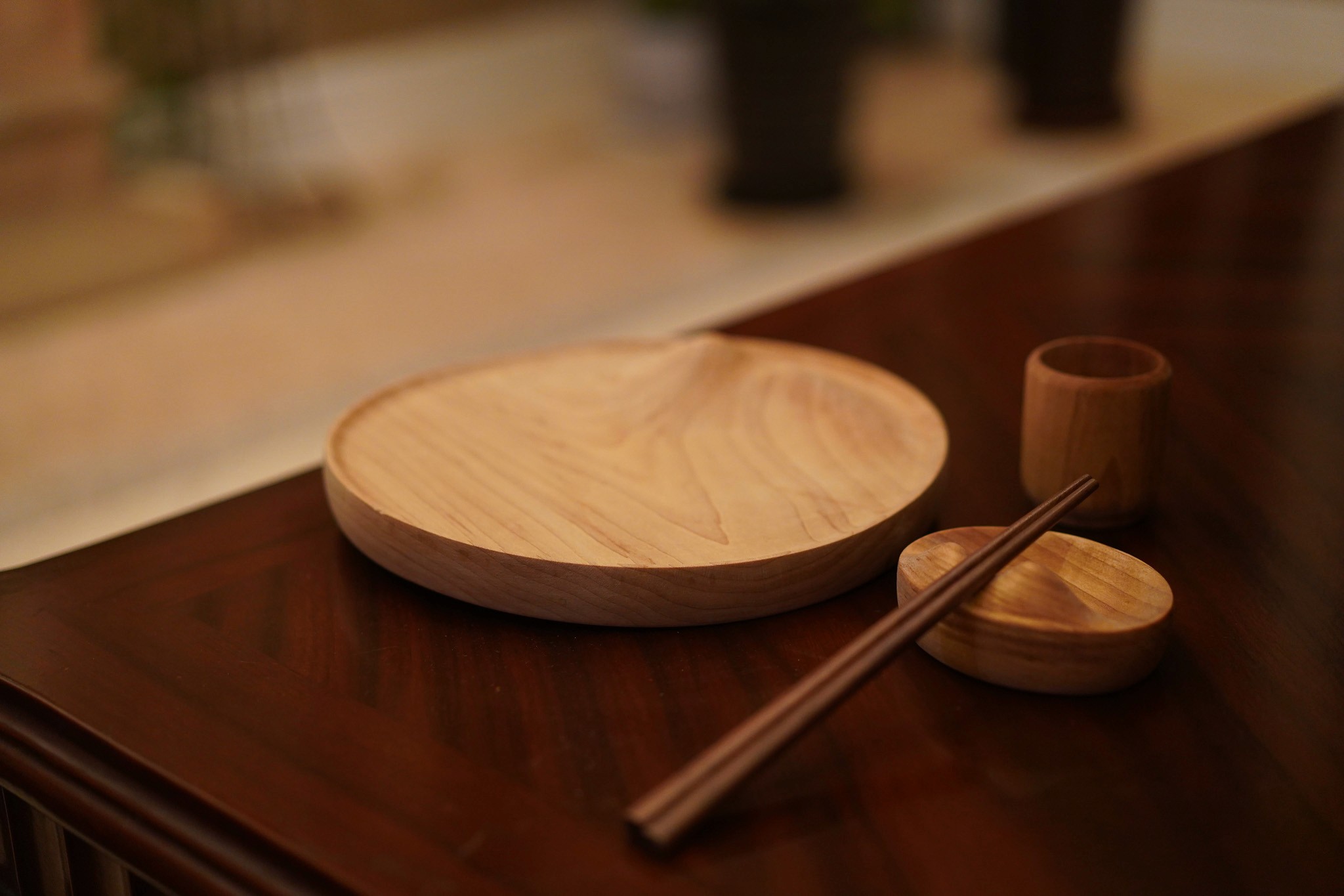
Special design of the utensils
This experience becomes more cohesive and branded with the help of special-designed utensils. The design of the utensils is inspired by the Chinese water-mountain painting.
Why this solution
During research, I learned that being able to understand what the dish exactly is is key while eating an exotic cuisine and making choices
Therefore, I came up with this solution because
01 It helps users to better envision the food through compelling visuals
02 A mixture of information (food description, ingredients, history) can better help users to make decisions
Design Challenge
Since it is not a traditional way of ordering food, here is the biggest design challenge.
How to make the interface more usable and intuitive for users?
To address the challenge, I went through the following process
Initial concepts
3 Initial concepts
USER TESTING
What elements do people prefer?
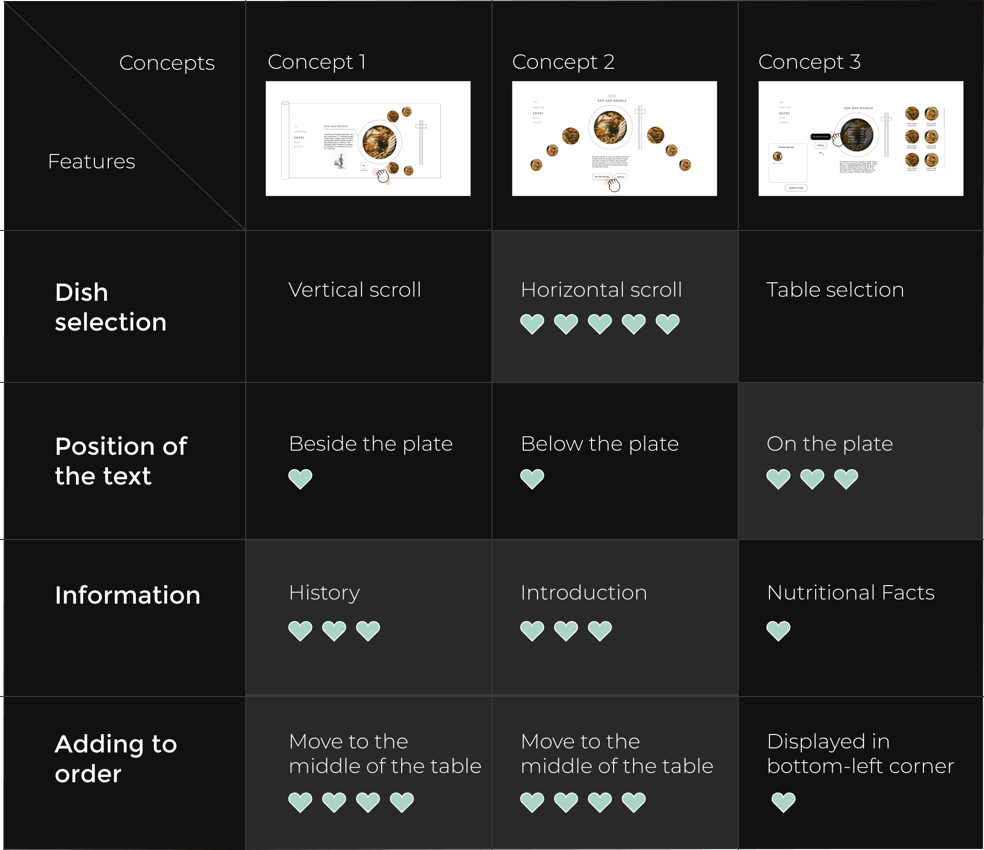
I tested these three concepts with 5 different people and summarized their preferences in the following table.
USER TESTING
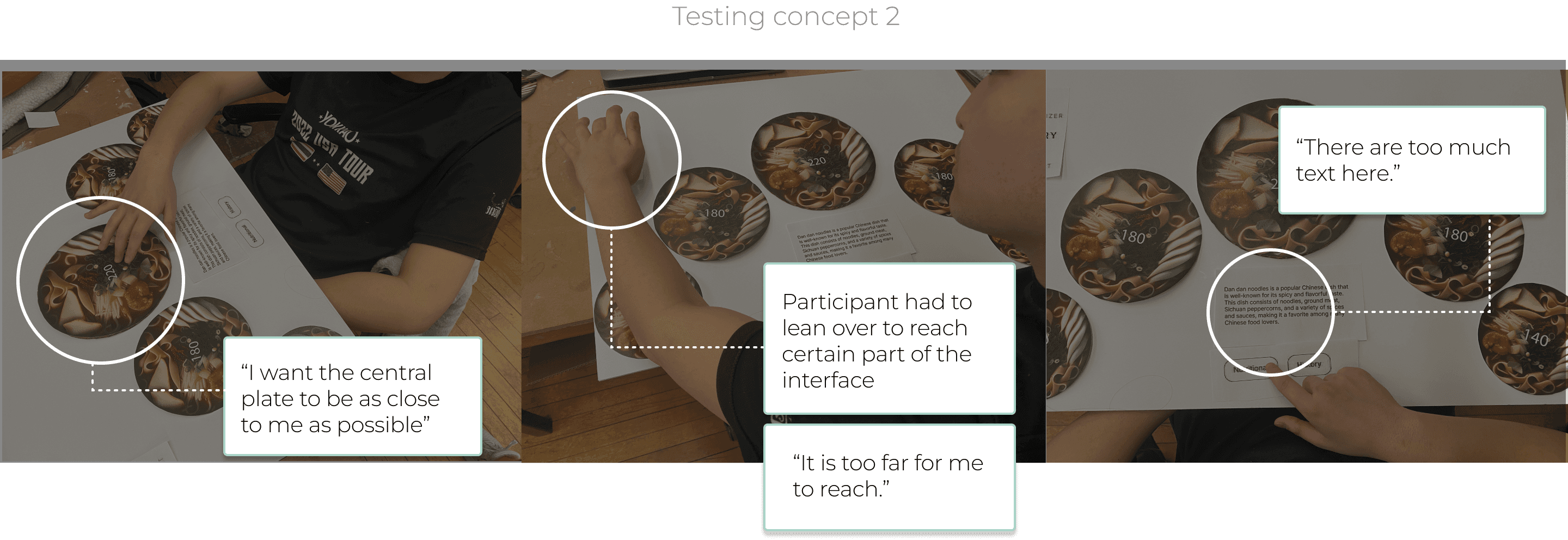
However, new challenges came to the surface after physical prototyping
Concepts 2 were liked by most of people. To further validate the usability of the concept, I made a physical prototype out of foam core and paper cut-outs.
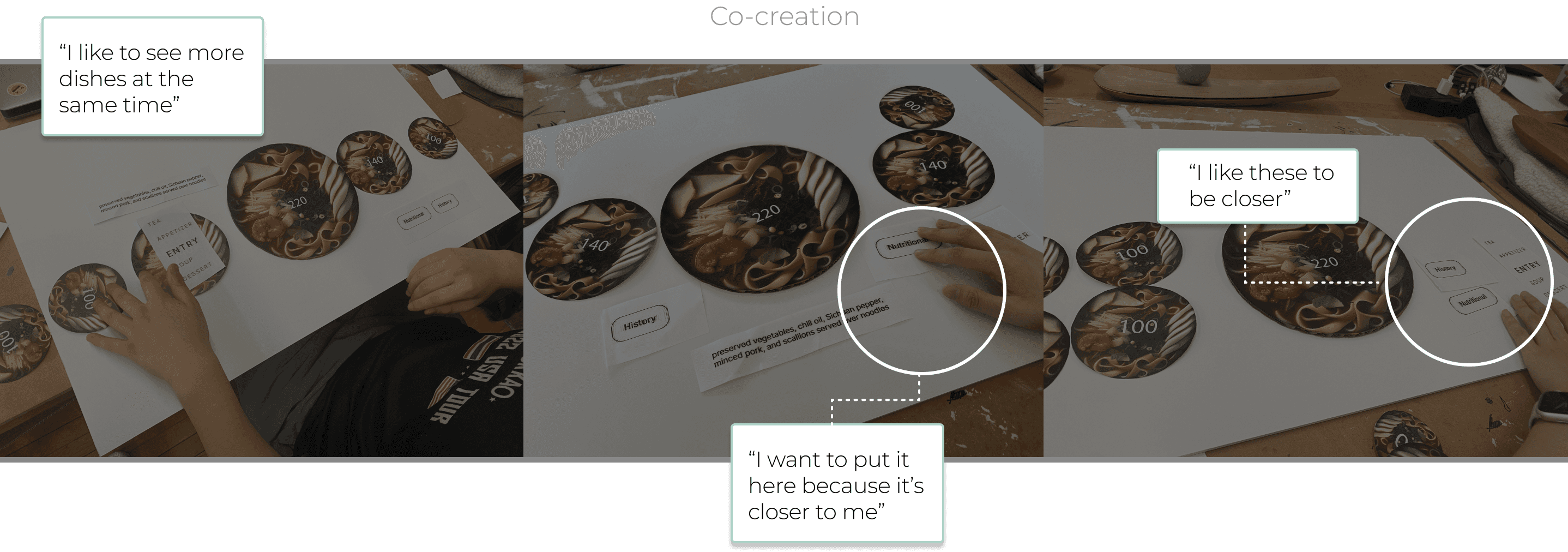
To test, I invited 3 people to interact with the physical prototype of the concept 2. After that, I also asked them to move around the paper cut-outs to create an ideal interface in their mind.
