Tutors Toolkit: Enhancing the PLUS Tutor Toolkit with Qualitative Data Integration
The PLUS Tutor Toolkit is a web-based application designed to assist after-school math tutors in effectively managing their students' learning journey. In this project, our goal is to enhance the app by providing tutors with improved tools for interpreting their students' progress and understanding their learning trajectory.
Context
An internship project for PLUS, an EdTech company
Outcome
Design delivered with one feature implemented, impacting 2000+ active users; Achieved 90% user satisfaction rate
Contribution
Research, Ideation, Visual Design, Interaction Design, Prototyping
Team
4 Design Interns + 1 Manager
BACKGROUND
What is PLUS and PLUS Toolkit?
PLUS is an EdTech platform that connects 10000+ k12 students from 15 institutions with 400+ volunteer math tutors through 1-on-1 online or offline tutoring.
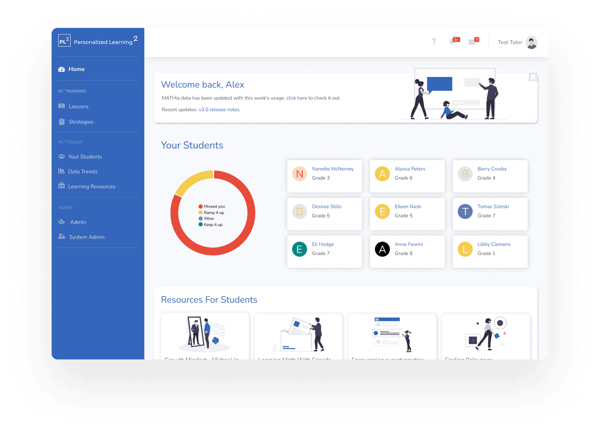
An AI-powered platform that helps tutors to monitor students' performance and assign learning resources.
Outcome
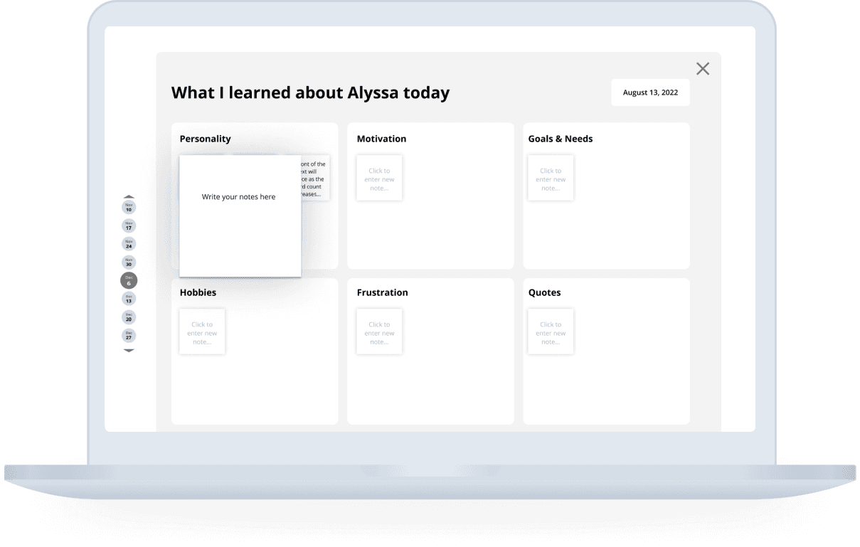
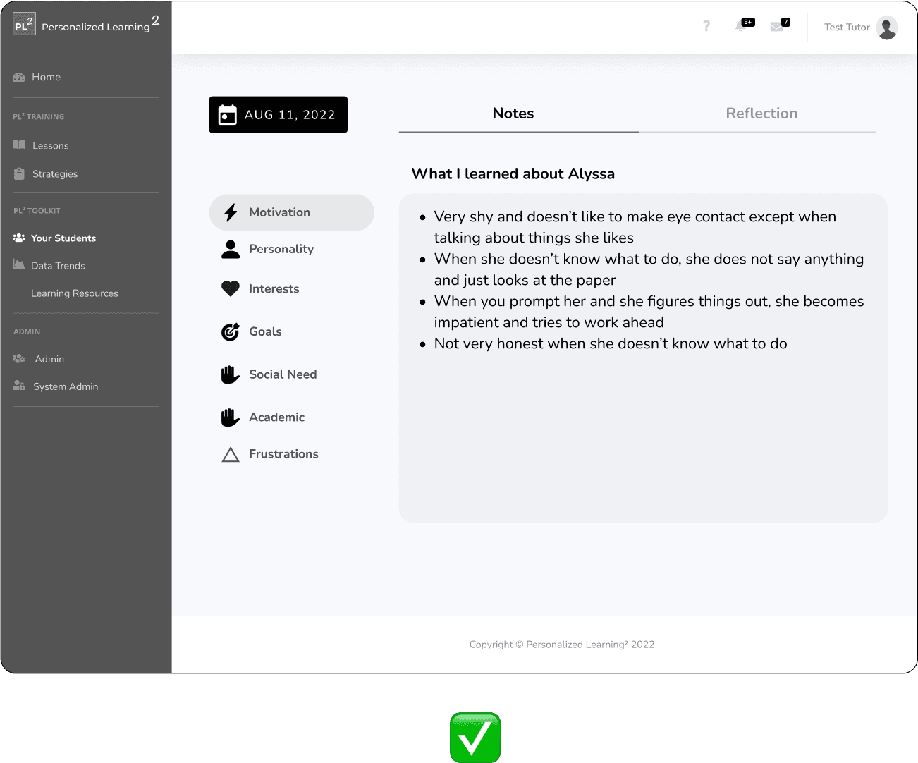
A note-taking feature for recording important observations and notes about students
With the categories, the tutors will be able to take notes on their students in a more efficient and comprehensive way.
Outcome
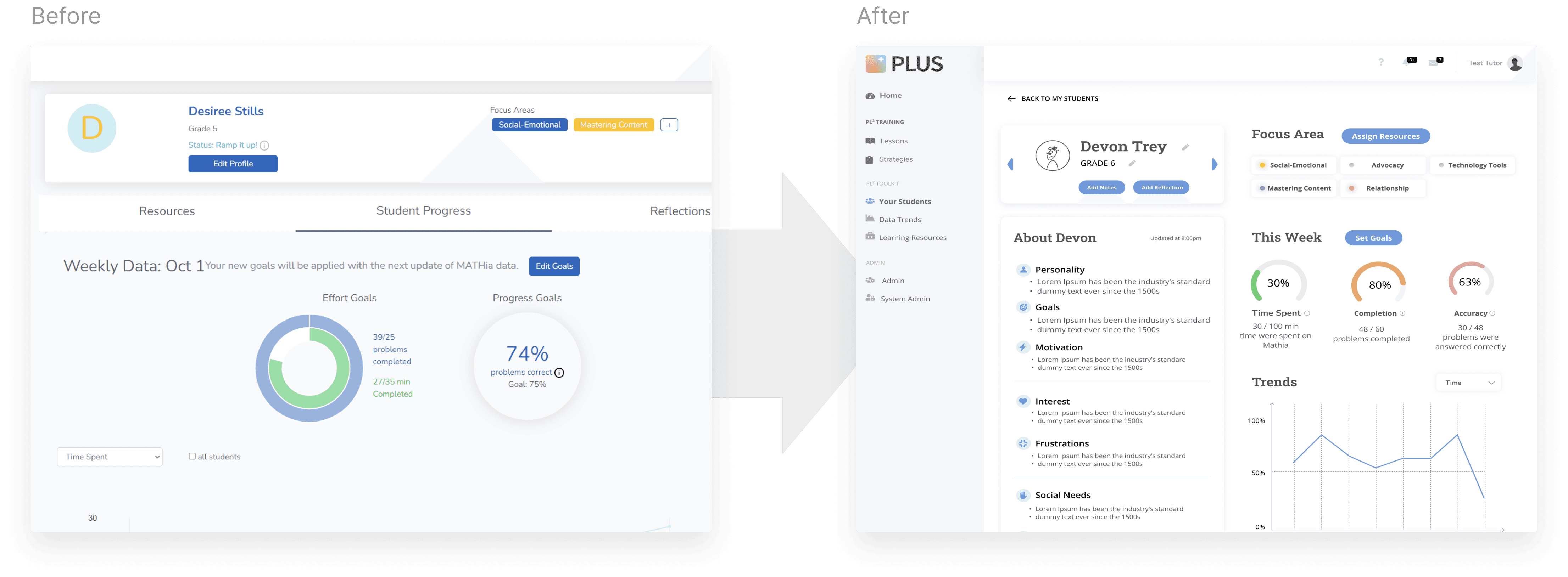
An enhanced student profile page with improved data visualizations
With both quantitative and qualitative data nicely presented, tutors can better understand individual student performance.
Outcome
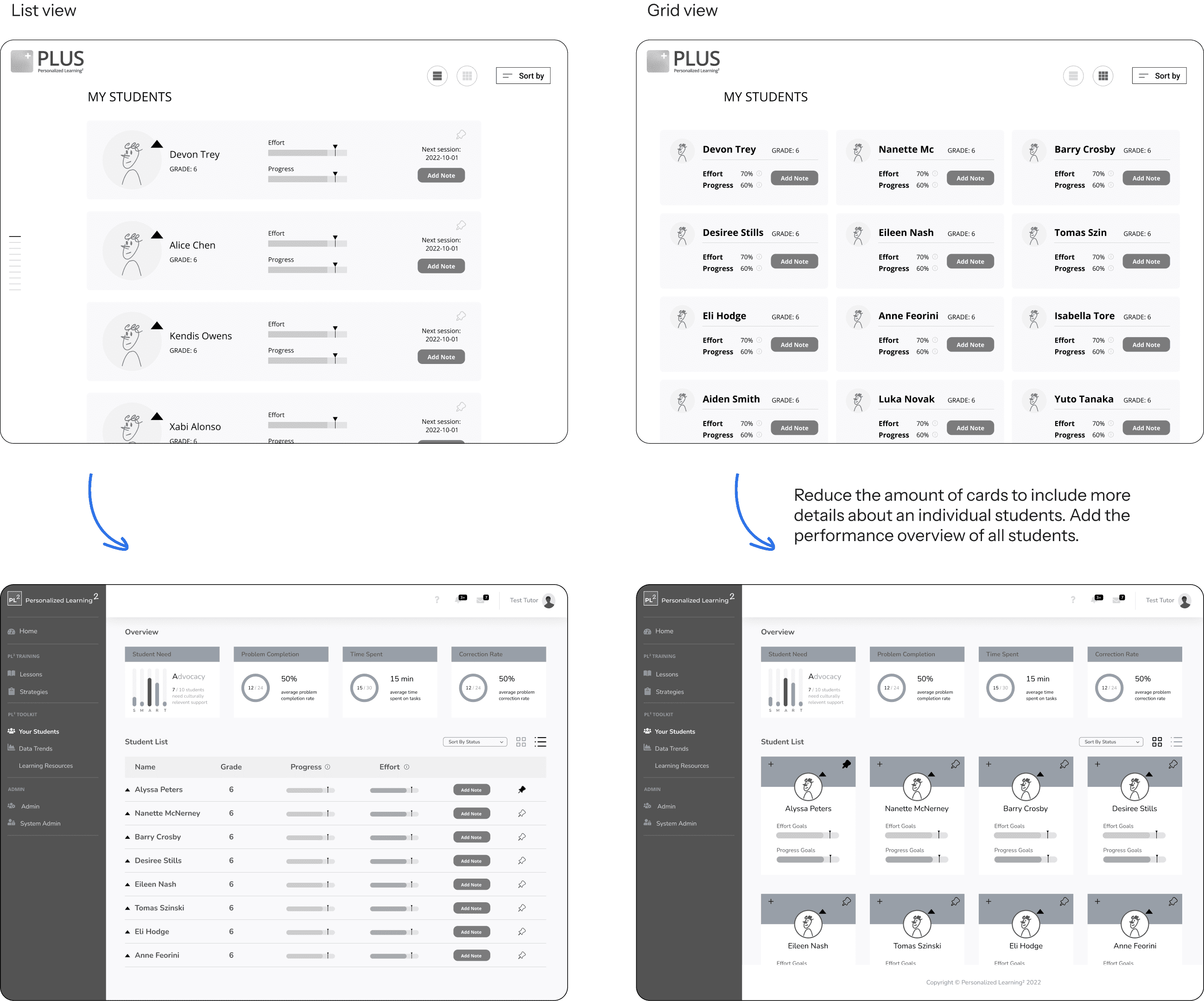
A more comprehensive and informative student listing page
With both summative and individual data, it helps tutors assess student performance more effectively.
Process

research
What is the underlying problem
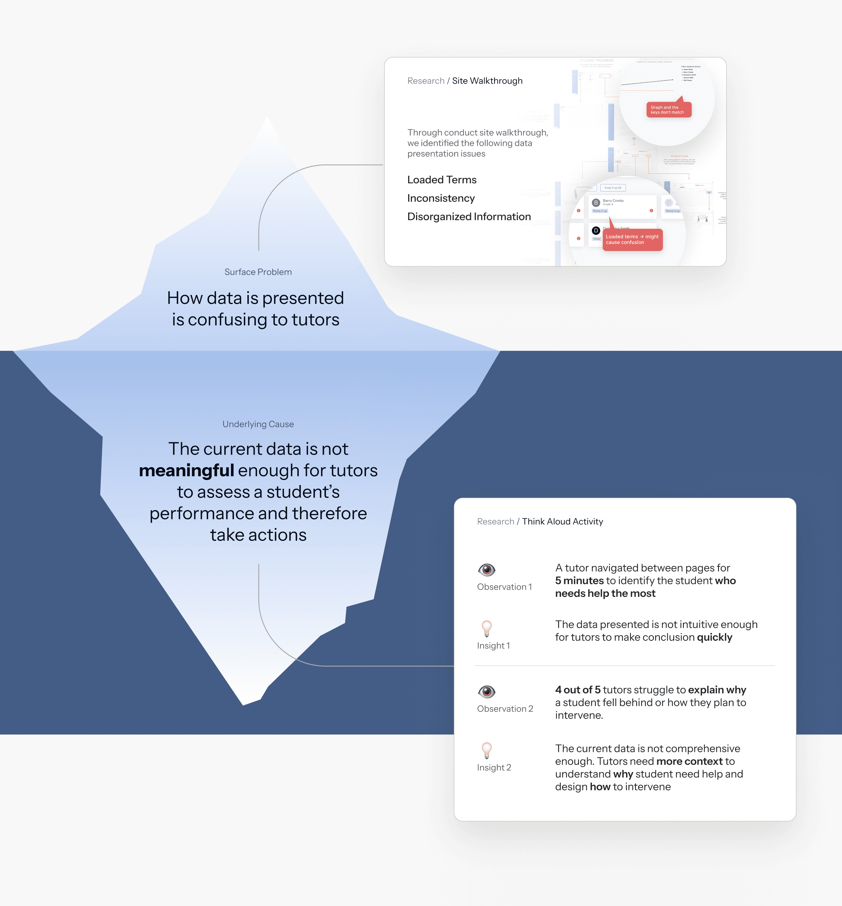
Our research methodology consists of two distinct phases: evaluative research, where we assessed the product itself to identify the problem on the surface, and exploratory research, during which we conducted think aloud activities with target users to learn more deeply about the root cause of the problem.
iDEATION
Users gravitated towards obtaining richer qualitative data to enhance their assessment of student performance.
In order to determine the most suitable data to utilize, we carefully chose some viable options and crafted storyboards around them. These storyboards were then presented to our users (tutors) for testing and feedback, allowing us to gather valuable insights.
Preferred storyboard
During the interview process, tutors expressed strong resonance with this concept and showed great enthusiasm as they shared their personal anecdotes about adapting their teaching methods to suit the unique characteristics of each student. Many tutors mentioned that they actively took notes on their personal devices to keep track of these valuable insights.
“I had a student who really enjoyed figure-skating. During my teaching, I found the student became more concentrated and interested when I made association between math concepts and figure-skating."
–––– Tutor A
Design process
The note-taking experience
Design Goals:
Make it easier for tutors to take notes efficiently during the tutoring session
Encourage tutors to take notes on various aspects of the students, focusing not only on their academic performance but also on their overall well-being.
We came up with this design initially to make it easier for tutors to categorize their notes according to the finding in the previous research.
To help us move forward, we conducted user testing with three tutors. The testing allowed us to validate key features and identify several issues.

We refined the design based on user feedback, which highlighted the need for a larger note-taking area. As a result, the new design expands the focus area, providing users with more space to take notes.

We presented this idea to the engineering team, and their main feedback was that the animation would be difficult to implement. In response, we adjusted the design to lower the engineering complexity and cost.
We switched from horizontal tabs to vertical tabs because they offer better scalability. As more categories are added in the future, horizontal tabs would become overcrowded and difficult to see.

However, for mobile view, we decided to use horizontal tab since it would leave more space for the note-taking area. Users will scroll horizontally to switch between categories, which we believe won’t be an issue since horizontal scrolling is a familiar interaction pattern for them.

Design process
The student listing page
Design Goals:
Make it easier for tutors to identify who needs help and who did well with ease
Accommodate varying scenarios: A tutor may manage just a few students or over 20 students at once. How should the interface be designed to handle both standard and extreme use cases effectively?
We came up with this design with both grid and list view to make it cater to different use cases. However, we discovered some issues and unmet needs after showing it to 3 tutors.
We also explored what thr mobile experience should be like and came up with the following three versions.

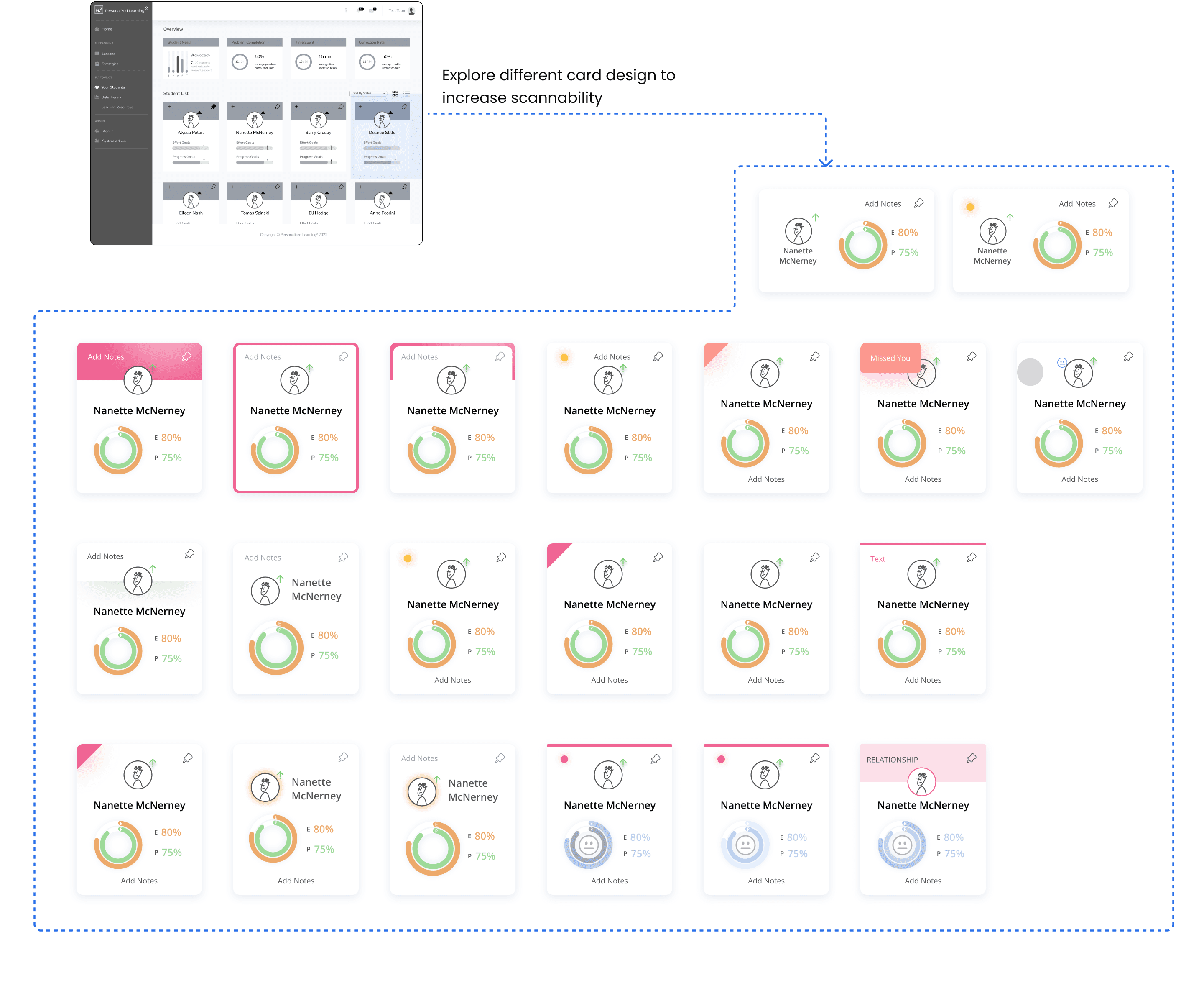
This is the final version we chose for the following reasons
Minimal use of colors to avoid a cluttered appearance when multiple cards are present.
Hovering reveals areas for improvement, also serving as an indicator of the hover state.
The use of emojis helps tutors quickly gauge the student’s overall performance.
Design process
The student profile page
Design Goals:
Incorporate the qualitative data of the notes being taken
Make it more efficient for tutors to assess this student’s performance through better information organization
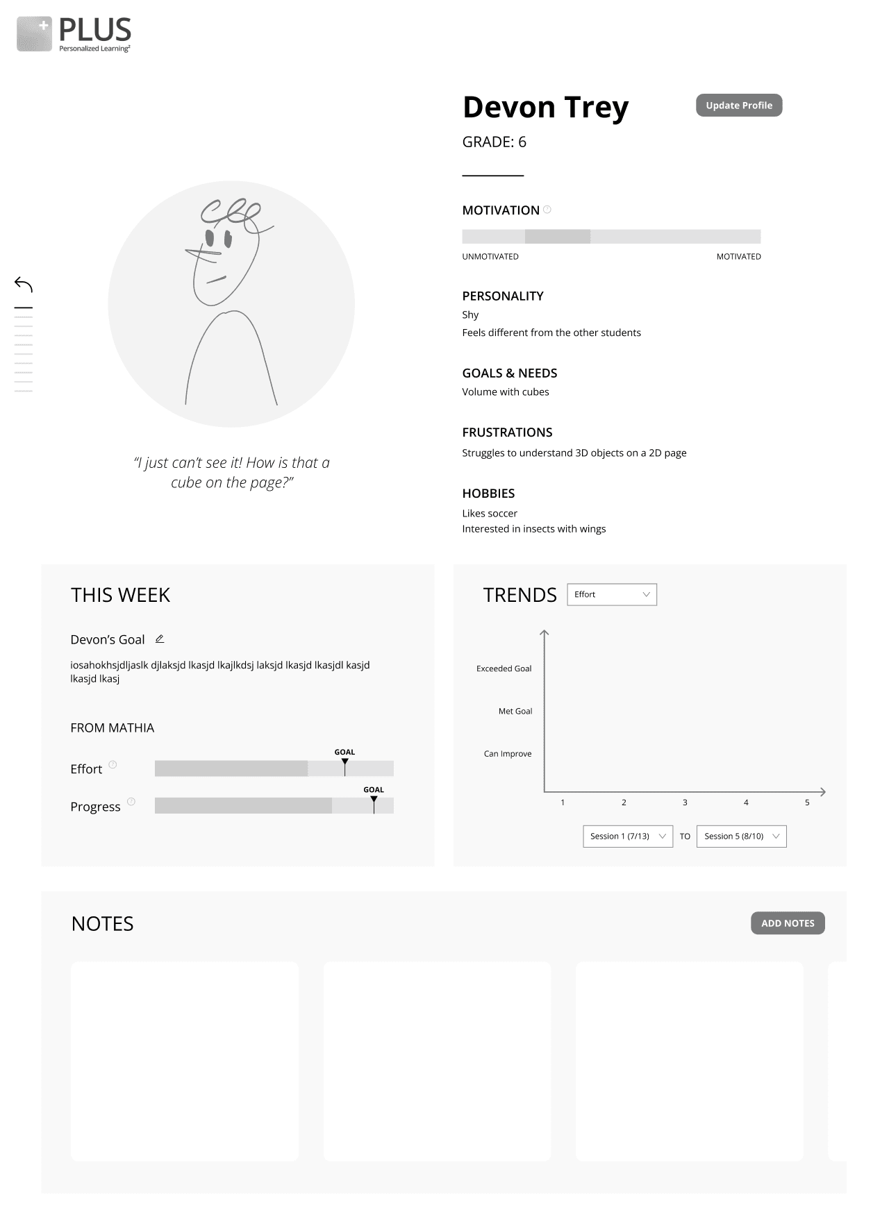
This is our initial design about the student profile page, where we emphasized on the profile photo and the notes about the student.
Information is too spread-out, which results into too much scrolling lowers the reading speed

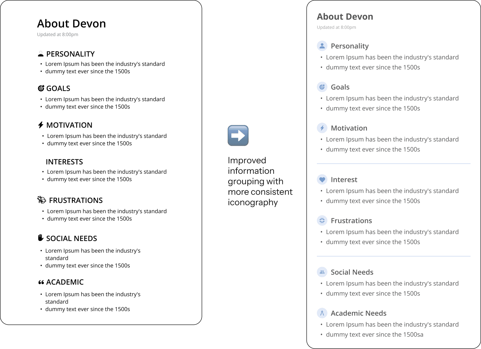
We made the layout more compact so that more information could be shown at once.

We recognized that adding more information could make it harder for users to read. To address this, we improved the grouping of information, making it easier and quicker to navigate.
REFLECTION
Factored in the opinions of developers in the middle of the design process
While designing the mid-fi prototype, we were uncertain about some design choices. Inspired by our manager, we conducted A/B testing with the development team, gaining valuable insights for decision-making. This experience highlighted the importance of collaborating with developers during the design phase, reinforcing that teamwork is essential for delivering a successful product.
Information visualization helped us to navigate in the fog
A major challenge in the research phase was managing the vast information gathered from external and internal audits and user interviews. To address this, we created a comprehensive user journey map to summarize key insights from each research source. This approach helped us easily identify underlying opportunities, allowing us to move forward effectively.
Used design tools to make internal team alignment
With varying time commitments among team members, attendance at every meeting was challenging, leading to alignment issues. After testing ideas with users using storyboards, I proposed we co-create a final set of storyboards to map out our direction. This approach effectively kept the team aligned and provided a clear update for our manager.
How to better hand over the design
Our handoff to the development team was also a success. We standardized group naming, element spacing, font sizes, and more, making implementation much easier for developers.


